How to: sensible default typography with a vertical rhythm
In order to help your users to read and interpret your content there are a few tricks we can pull out when designing websites. First off, we have to make sure the font is large enough to read, that there’s enough contrast between the body text color and the background, that the lines of text in each row aren’t too long (about 45-65 characters is optimal) and then there’s to set up a typographic rhythm that helps your users to read.
Let’s talk about the rhythm part in this article
If you’re designing for print you have it easy. Just enable the baseline grid in Quark or InDesign and set the increment based on your designs line-height. Sad for us web developers/designers, I’ve yet to see this option in my code editor.
When designing on the web, there’s only so much we can do. We can control font size, line height and margins or paddings. When we then write, or hand out the website to our client and watch them add content on their own, we must have calculate the above factors with care in order to maintain the rhythm indented.
Luckily there are tools to help us.
Introducing Compass Vertical Rhythm
If you’re reading this you’re probably already familiar with SASS and Compass. SASS is a meta-language of CSS that’s used to describe the style of a document cleanly and structurally, with more power than flat CSS allows. Compass is a CSS framework that work together with SASS, full with reusable patterns and CSS3 mixins for your stylesheets.
Using SASS you set variables in your stylesheets and that will automagically update the math and help your designs vertical rhythm.
byType
In order to keep my code DRY I’ve set up a base style sheet, that enables vertical rhythm, that anyone can use when setting up their projects. It’s like a small CSS typographic framework that’s not intended to use as-is, but rather to fork and make your own.
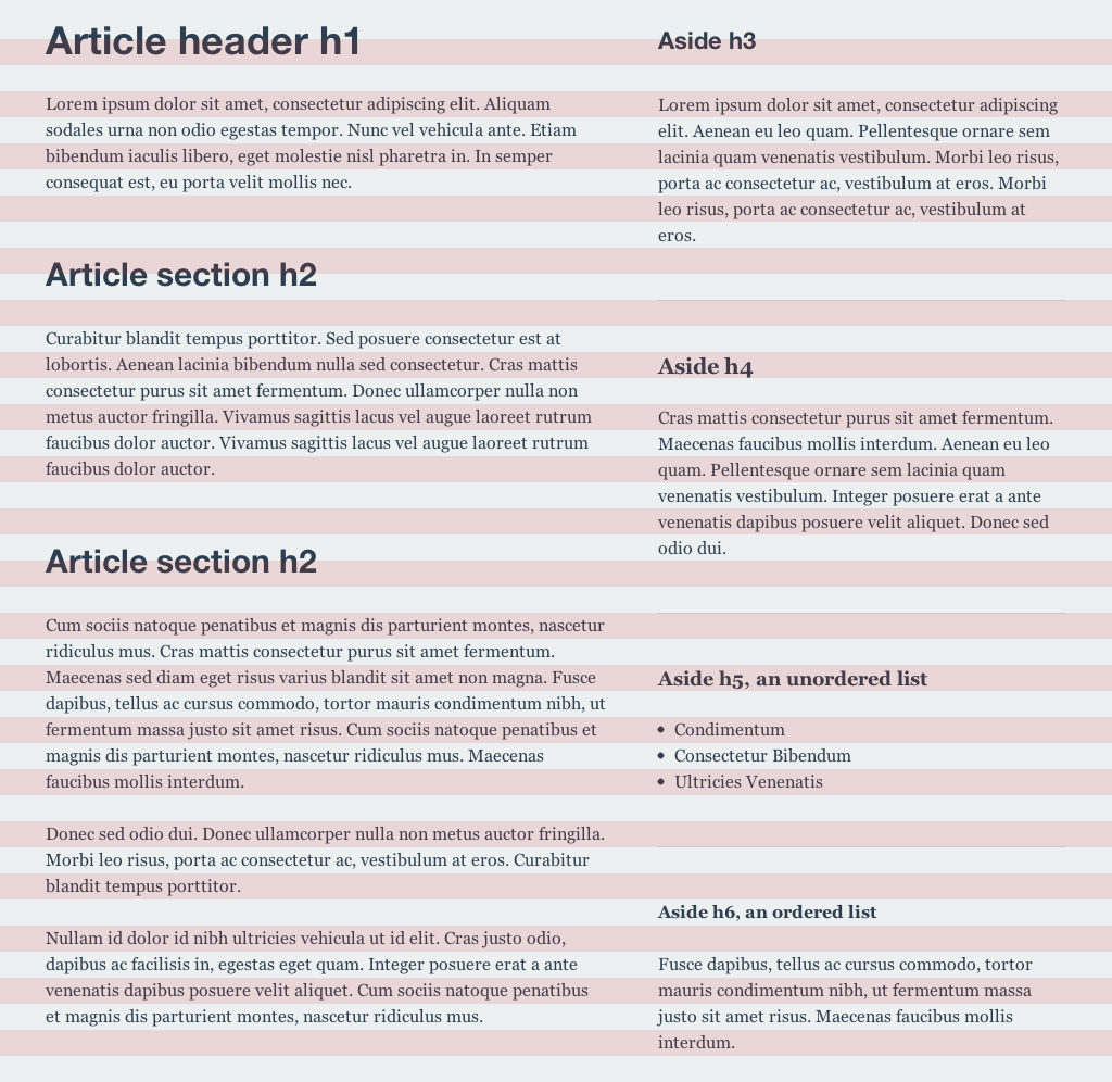
Here’s an example image of byType in action. Notice how the right sidebar align correctly with the text in the left main column area.

Now: let’s look at some code.
To start things off, we need to make sure we include Compass in the beginning of our style sheet. Let’s do that.
/* Make sure you have access to Compass. If you already have included Compass into your project, remove this line below. */
@import "compass";
Now that that’s all taken care of, let’s define some variables that will help us throughout our project.
/* Fonts size and line height defaults */
$base-font-size: 16px; /* Sets the browser default size. */
$base-line-height: 24px; /* Baseline grid. */
@include establish-baseline; /* "This is where the magic happens" —Everyone on MTV Cribs. */
These lines above are editable and will be the base on witch the entire stylesheet calculates the margins and paddings. $base-font-size and $base-line-height are normal variables you can use in SASS. But establish-baseline is a mixin available to us since we’ve included Compass at the top of our stylesheet. This will go to the Compass library installed on our computer and pull the code we want and add it into our stylesheet when we compile our final CSS file.
We go on and add more styles to our CSS and when we need to add something like margins or font sizes, we do it this way as I’ve done for our headings style.
h1 {
  @include adjust-font-size-to(36px);
  margin: 0 0 rhythm(1, 36px) 0; /* 1 line below */
}

h2 {
  @include adjust-font-size-to(30px);
  margin: rhythm(2, 30px) 0 rhythm(1, 30px) 0; /* 2 line above, 1 line below */
}
This will keep the math at a minimum and make everything align correctly. But what if we where to add a border below an element, surerly that would mess up the vertical grid, right? Nope, thanks to Compass you’re covered.
Compass comes with lots of different mixin to handle this stuff for you, so for the border example you can just write @include trailing-border(5px) and it will add a trailing border, five pixel thick without throwing your vertical rhythm off by five pixels. Pretty neat, huh? To see what else Compass can help you with I suggest you go check out the official vertical rhythm section of the Compass documentation website.
Have a look around
There are lots of different tools to handle your web typography and I hope you’ll learn every little piece of it. If not, please consider using byType as a starting boilerplate for your next project.
Besides helping you with your vertical rhythm, I’ve also enabled some other goodies like antialiased font smoothing for webkit browsers, ligatures for headings (if you have fonts that support it) and hacks to stop certain devices scale text incorrectly.
Feel free download, fork or whatever, byType at our Github repository →
